Search,
Simplified
Redesigning internal search at enterprise scale — one focused system, fifteen seconds saved per search, every day.
Six tools. No single source of truth. 100k+ people paying the cost.
People don’t want better results. They want to stop searching.
15 seconds saved per search. One system replacing six.
The Problem
Six tools. No single source of truth.
Employees were switching between multiple internal systems to find the same answer. HR policy in one place. IT documentation in another. People directories somewhere else. Every search was a small act of archaeology.
The cost wasn’t just time — it was trust. When search doesn’t work reliably, people stop trusting it. They ask a colleague instead, or they give up.
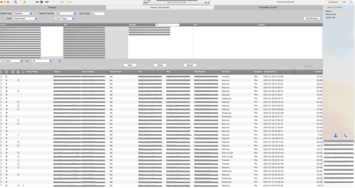
Before — six disconnected systems, no unified experience.
The Insight
People aren’t searching. They’re trying to get something done.
Early on we framed the problem as “search results.” After research, we reframed it: search is a workflow, not a destination. People don’t want better results — they want to stop having to search in the first place.
That shift changed everything about how we prioritized features. Smart filters over keyword matching. Contextual grouping over raw lists. Quick actions right from results.
Two early directions — search as destination vs. search as workflow enablement.
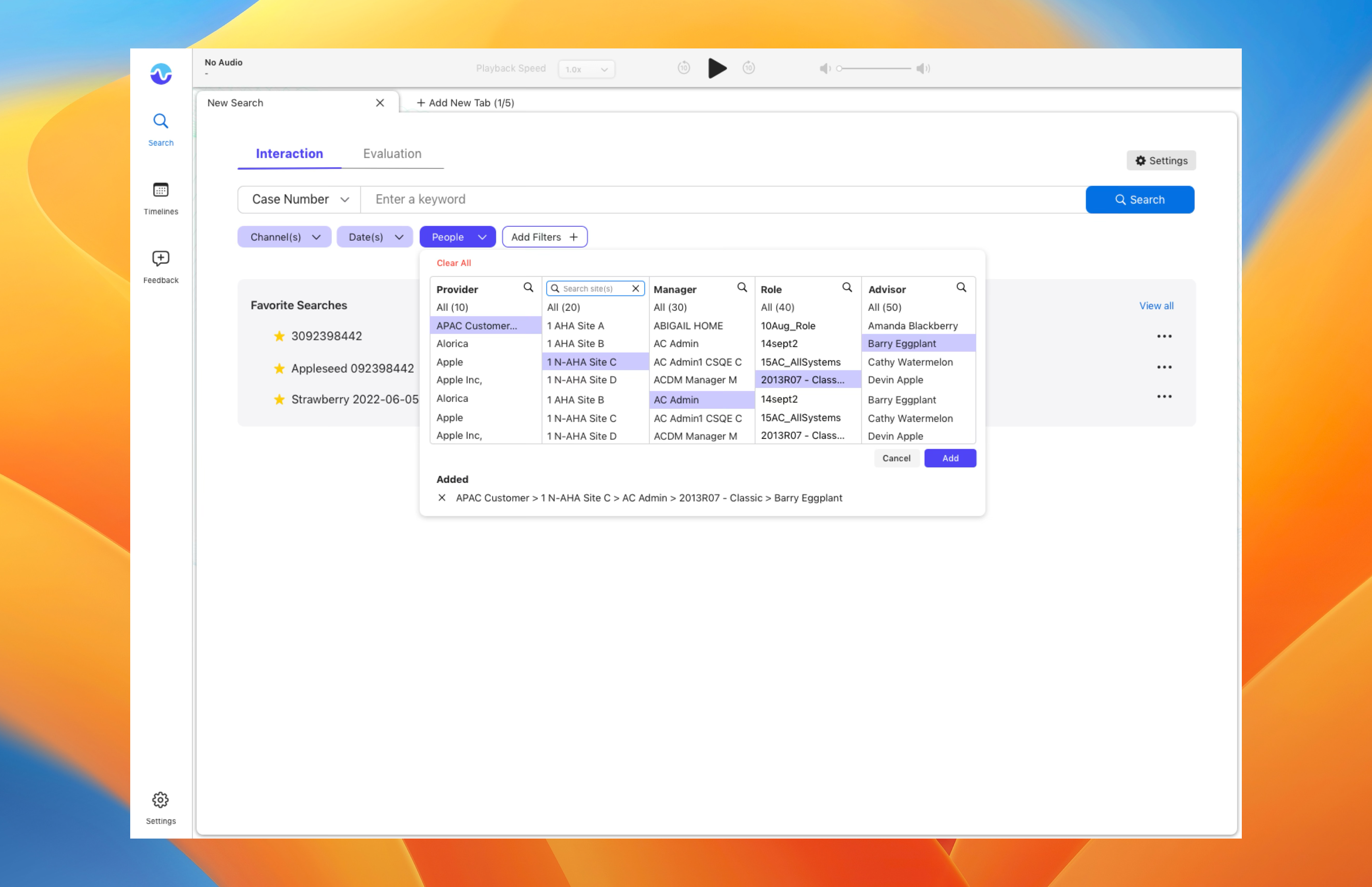
Key Features
One surface. Three principles.
Unified. All content types — people, documents, policies, tools — surfaced from a single query. No more choosing which system to search.
Contextual. Results grouped and ranked by relevance to the query type. Looking for a person gets a different layout than looking for a policy doc.
Actionable. Common next steps — send a message, open a document, book a meeting — available directly from results without navigating away.
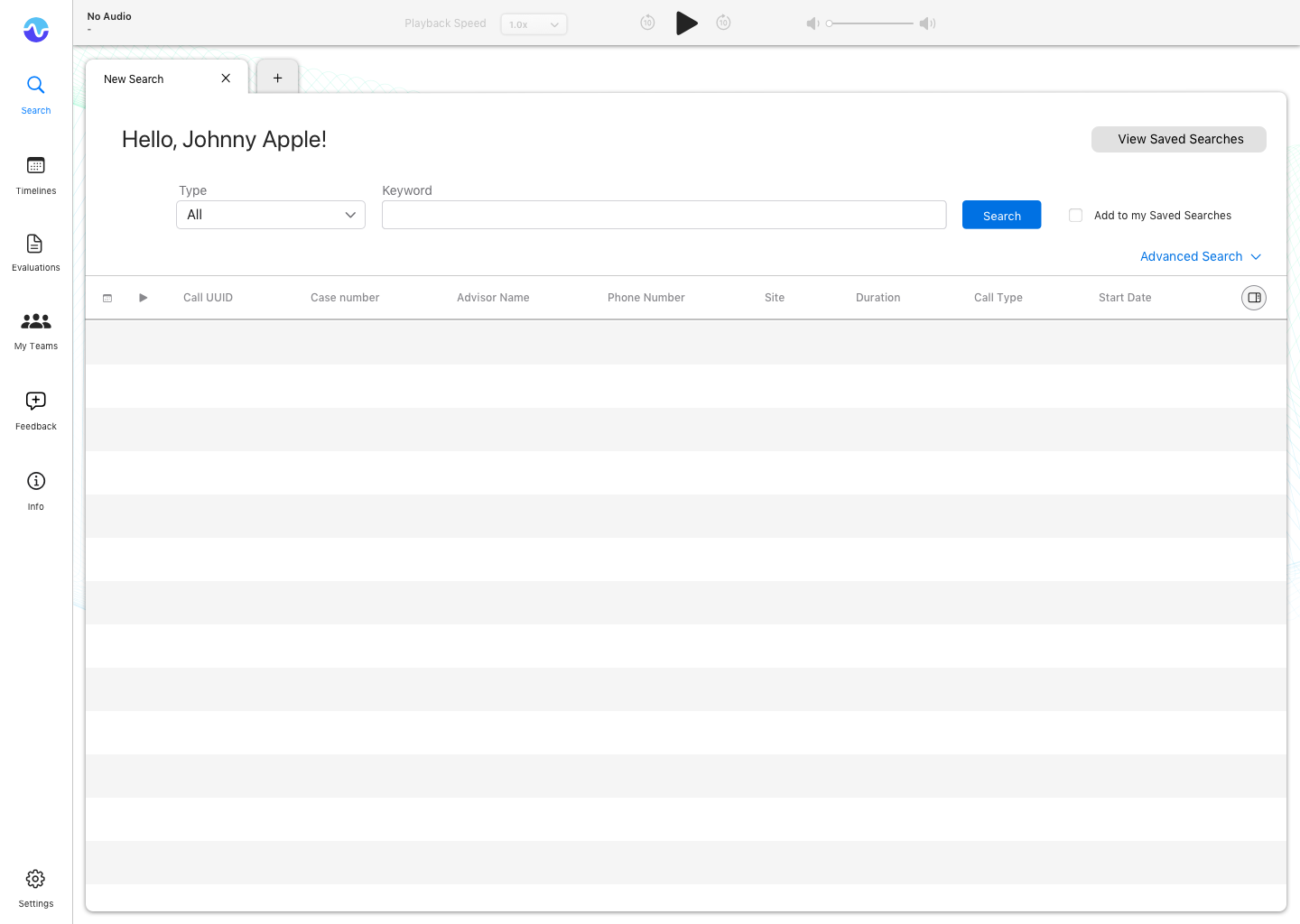
Search entry — instant results as you type, no submit required.
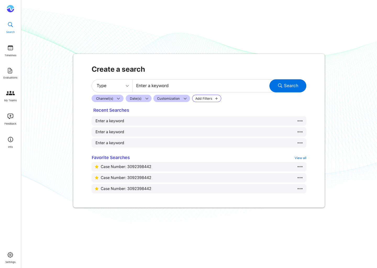
Smart filters — surface the right facets for each query type.
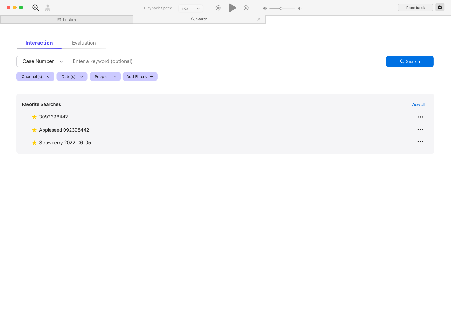
Final design — unified results with contextual grouping and quick actions.
15s
Saved per search, every day, across 100k+ employees
1
System replacing six disconnected tools
↑
Trust in search as a reliable daily tool
“Fifteen seconds doesn’t sound like much. Multiplied by 100,000 people, every day, it’s a different number entirely.”